How to Set Up an In-App Welcome Message with Examples

How to Set Up A Welcome Message in Your App: A Step-By-Step Guide
Why Use In-App Welcome Messages?
Imagine walking into a party, and no one says “Hi.” Pretty awkward, right? A good in-app welcome message gives your users the grand entrance they deserve. Well-crafted welcome messages can increase user retention by up to 50%! And with Hopscotch, you can do it without any tech wizardry. Let’s roll out that red carpet with style.
What exactly is an In-App Welcome Message?
An in-app welcome message (sometimes called a welcome screen or welcome page) is the first message or modal a new user sees after signing up or logging into your app. It's your chance to say hello, guide users toward the first key action, and set the tone for their journey. Done right, it’s the spark that ignites user activation and long-term engagement.
Key Benefits of Welcome Messages
Accelerate Activation: Help users reach their "aha" moment faster.
Improve Retention: Keep users engaged by setting expectations and showing value early.
Boost Onboarding Flow: Kickstart walkthroughs, checklists, or tutorials.
Segment Users Instantly: Use micro-surveys to route users by role or intent.
Build Trust and Delight: Create a first impression that feels warm, useful, and intentional.
Types of In-App Welcome Messages
Basic Greeting: A friendly "Hi" with brand flavor.
Quick Start Tour: Links into your product tour or guides.
Segmenting Survey: Ask what brought them here or what they hope to achieve.
Checklist Launcher: "Here are your first 3 tasks to get started."
Help & Resources: Link to docs, support, community.
Celebratory or Fun: Add delightful copy or visuals for a warm emotional tone.
Personalized Welcome: Uses segmentation to deliver a tailored experience based on user type, behavior, or role (e.g., greeting new users differently than returning ones).
Promotion Message: Encourages users to explore premium features or new tools. Be careful not to overuse this type early on, as it can come across as pushy.
📚Also read: The 12 Best Ways to Increase SaaS Retention
How to Set Up A Welcome Message in Your App: A Step-By-Step Guide
1. Sign Up for Hopscotch -- it's free!
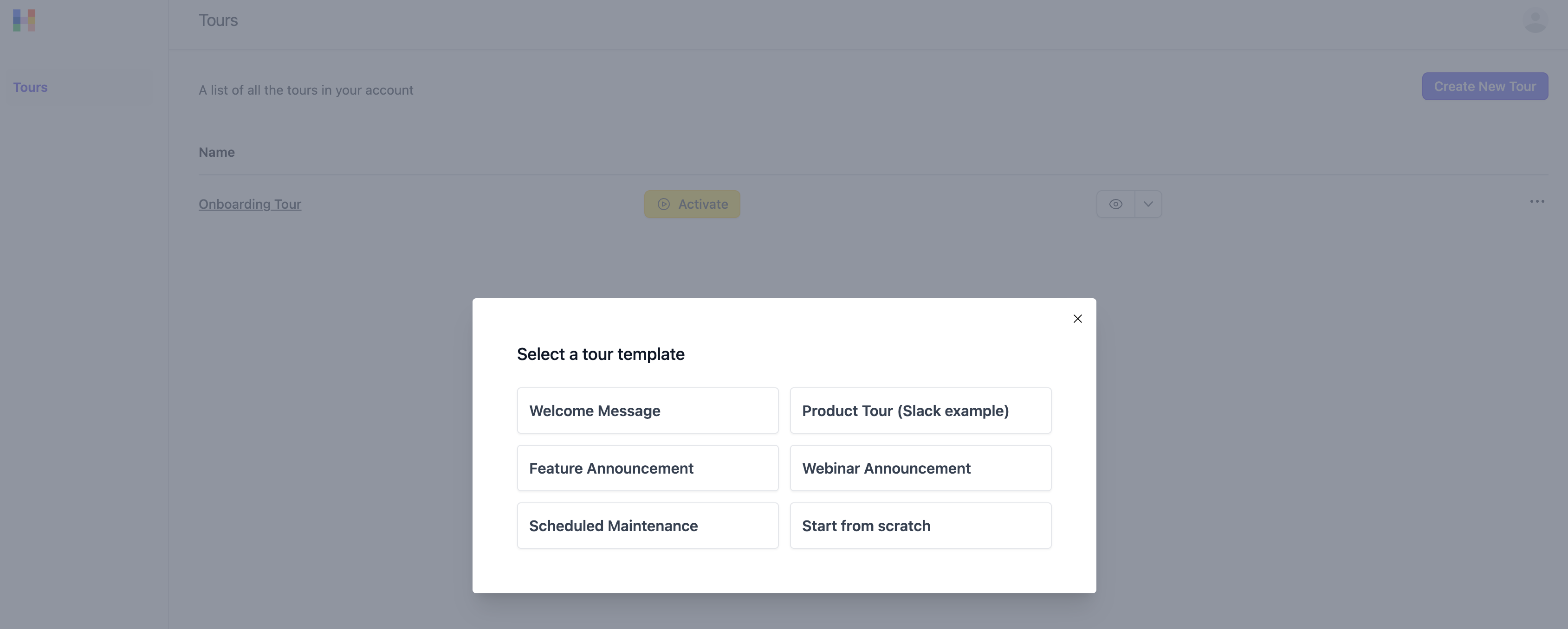
Sign Up for Hopscotch (it's free) and click "Create New Tour” and select "Welcome Message".
2. Choose Your Target Page and User Segment
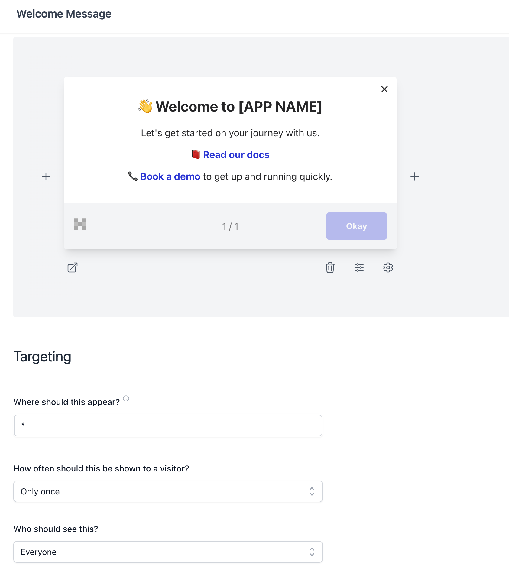
Decide which page the welcome message should appear on (e.g., homepage or dashboard) and define your target audience. If you want the message to appear only for first-time users, you can use Hopscotch’s segmentation features.
Tip: For best results, segment new users separately to ensure that the welcome message is only displayed to those who haven’t explored the product before.
3. Customize the Content
Add a friendly greeting (e.g., “Welcome to [Your App’s Name]!”) and include a brief introduction or a CTA (like “Take a Tour” or “Explore Key Features”).
Formatting: Use text formatting options to make the message visually engaging. Include your brand colors, a logo, and any relevant icons to make the message visually cohesive.
4. Include Interactive Elements
Add buttons that link to additional resources like tutorials, product tours, or FAQs. You can also include a skip option for users who want to navigate directly to the app.
5. Use Hopscotch’s Preview Feature
Preview the message to ensure it appears correctly on both desktop and mobile devices. This step allows you to catch any layout issues before going live.
6. Install the Hopscotch script
To preview your tour you must first install the Hopscotch script. It's easy -- just paste the code snippet into your app just before the closing </body> tag.
7. Activate Your Welcome Message
Once you’re satisfied with the preview, click activate to set your welcome message live on your app!
Watch this video of an example welcome message in action.
Real-World Examples of Effective In-App Welcome Messages
1. DropBox's Friendly Welcome Prompt
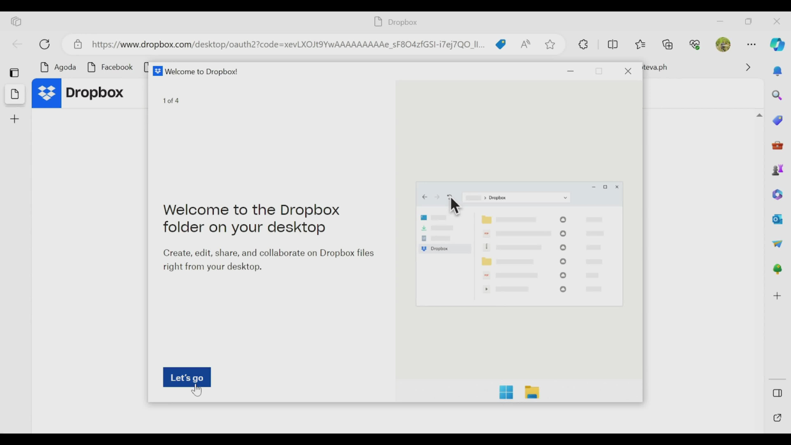
The Dropbox welcome message provides a friendly and concise introduction to the Dropbox desktop folder, aimed at helping new users feel comfortable with the tool. The message reads, "Welcome to the Dropbox folder on your desktop," and goes on to highlight the main benefits: enabling users to create, edit, share, and collaborate on files directly from their desktop. To keep it simple and actionable, Dropbox includes a "Let's go" button at the bottom, which leads users to access a guided tour.
This welcome message is a great example of a minimalist approach to onboarding, offering just enough information to help users understand the core functionality without overwhelming them. The visual on the right side adds context, showing a quick snapshot of what the Dropbox folder looks like on a typical desktop interface.
2. Canva’s Segmented Welcome Tour
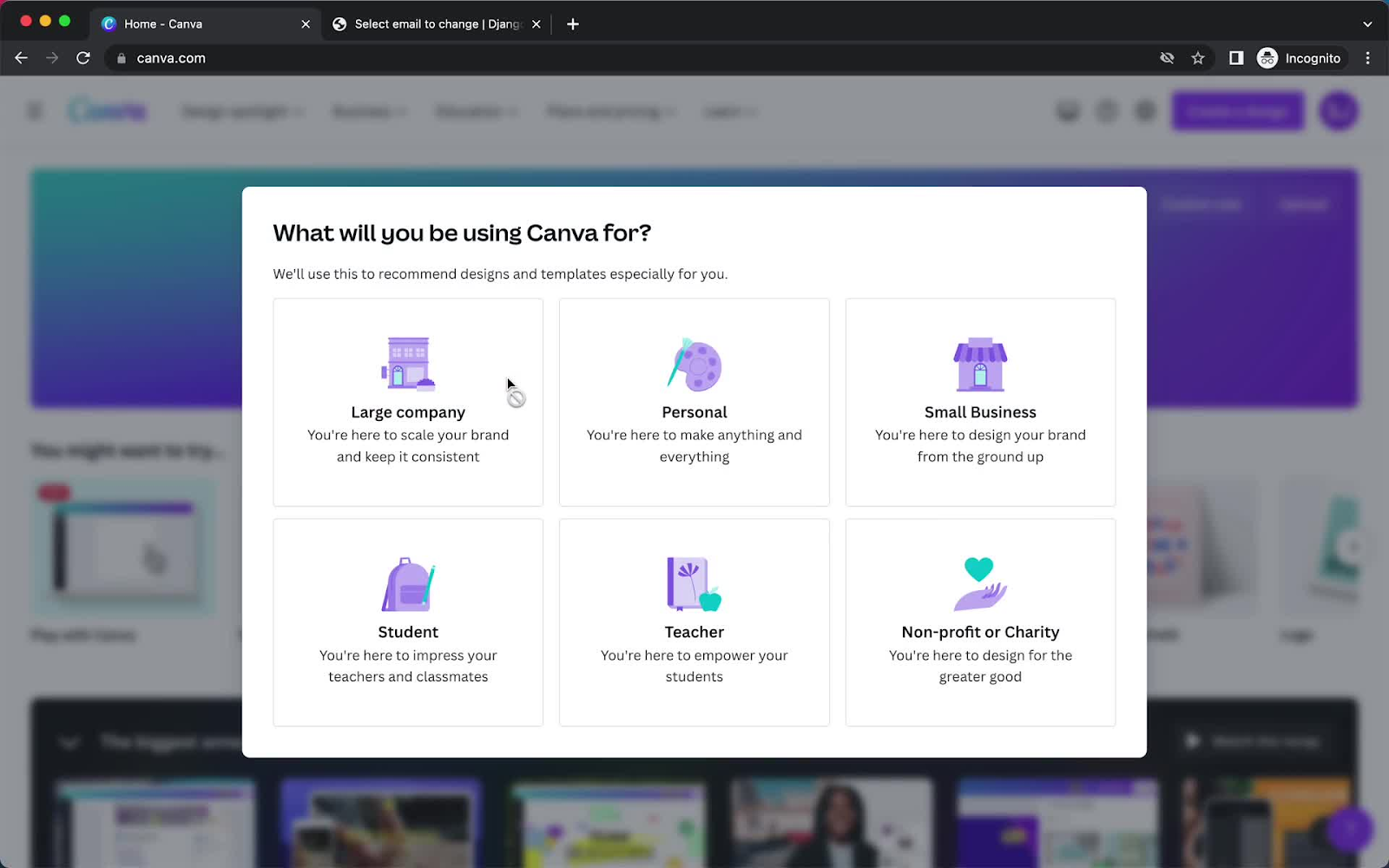
Canva welcomes users with a brief survey that segments them into different types of users, like designers or content creators. This tailored onboarding flow ensures that users see relevant features based on their goals.
3. Asana’s Guided Feature Highlights
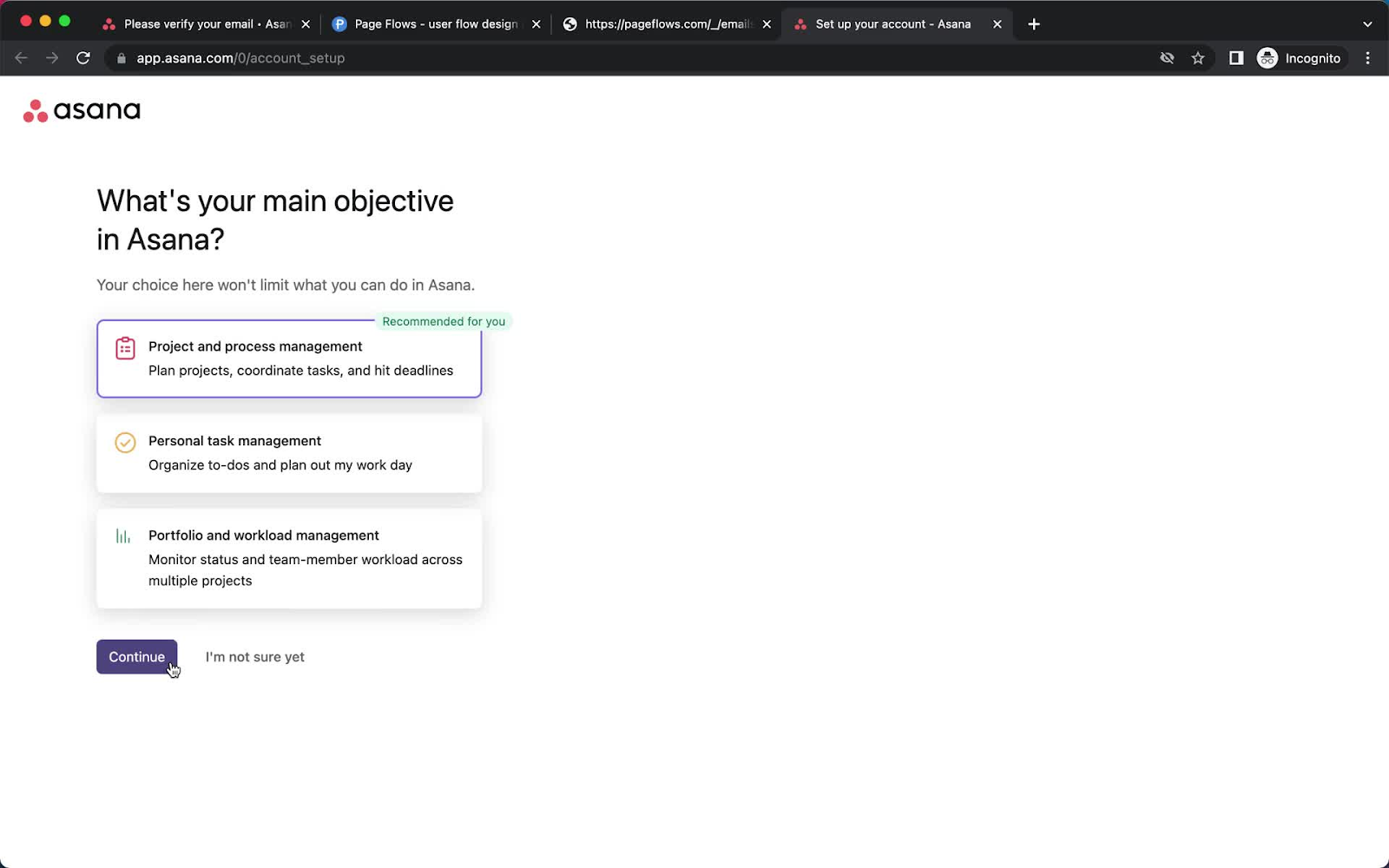
Asana greets new users with a quick walkthrough of key features and a short onboarding checklist, enabling users to explore core functions right from the start.
4. Calendly's Simple Welcome Message
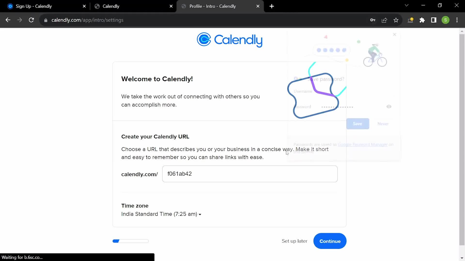
Calendly’s welcome message is a simple, user-friendly introduction to setting up an account. It greets the user with “Welcome to Calendly!” and reinforces its value by saying, “We take the work out of connecting with others so you can accomplish more.” This short description is effective in positioning Calendly as a time-saving tool.
5. Slack's Minimalist Greeting
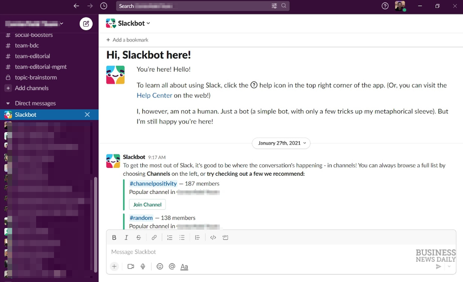
Slack welcomes users with a straightforward message: “Welcome to Slack!” accompanied by a friendly wave emoji. The simplicity encourages users to dive right into creating channels and starting conversations.
6. Pinterest's Interest Selection
Pinterest prompts users to select topics of interest during onboarding, tailoring the content feed to individual preferences. This immediate personalization enhances user engagement.
7. Duolingo Uses Gamification
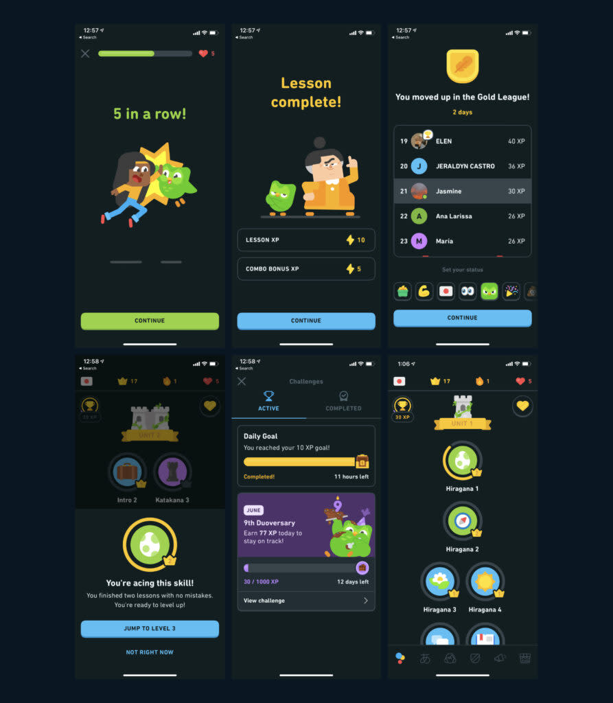
Starts user with a single, achievable action (first lesson) — gamified, delightful. Immediately after signing up, the user is prompted to select their language learning goal and complete their very first lesson. The progress bar, points system, and streak counter begin right away — giving a sense of momentum and accomplishment. This gamified welcome flow is not only fun but highly effective at pulling users into the habit loop from day one.
8. Headspace's Calming Onboarding
Headspace greets users with calming visuals and simple language designed to soothe. Right after the welcome screen, users are asked to choose a goal — like reducing stress or sleeping better — and are immediately guided into a short meditation. This clear path to value helps users feel a sense of clarity and purpose right away, aligning their onboarding experience with the product’s core promise of mental wellness.
9. Strava’s Choose-Your-Own-Adventure Start

Strava’s Route Builder welcomes users with a clean modal overlay and two clear paths: “Explore on my own” or “Take a tour.” This simple fork respects different learning styles—those who want to dive in versus those who prefer guidance. The bold CTA buttons and map backdrop reinforce the product’s purpose (adventure planning) while immediately offering value and clarity. It’s a great example of giving users agency without overwhelming them.
10. Replit’s Developer-Friendly Tour Prompt

Replit welcomes users with a dark-themed, in-product modal that introduces them to the “Workspace” — the central area where code is written and projects live. The modal uses clear, friendly language tailored to new developers and kicks off a multi-step tour to ease them into the environment. By calling out specific terminology ("Repls") and offering a “Next” button with visible progress dots, Replit creates a gentle, low-pressure introduction to what could otherwise feel like a complex interface.
11. Sophia’s Video-Based Course Orientation

Sophia welcomes users with a fullscreen video modal titled “Course Orientation.” The message is clean, high-contrast, and immediately cues users to click play. By using a short video (under 5 minutes) to walk through expectations and structure, Sophia sets a calm, clear tone for new learners. This format is especially effective for educational platforms — reducing cognitive load while providing rich, visual guidance upfront.
12. Splunk’s Contextual First-Time Prompt
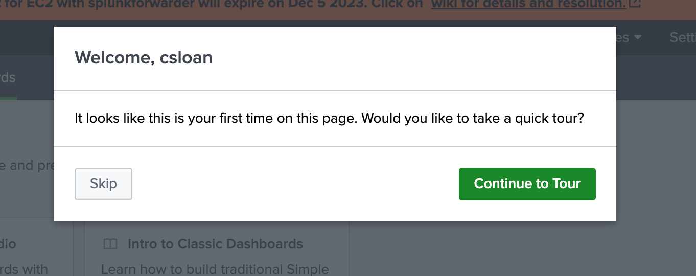
Splunk detects first-time visits and greets users with a straightforward, personalized message: “Welcome, csloan.” It immediately offers a choice — “Skip” or “Continue to Tour” — giving users full control. This welcome message is minimal, contextual, and action-oriented, offering support without disrupting flow. By addressing the user by name and clearly recognizing the novelty of the visit, Splunk creates a helpful, low-friction entry point for learning.
13. PagerDuty’s Guided Entry to a Complex Tool

PagerDuty welcomes users to its Service Graph feature with a clear, focused modal that explains the tool’s purpose and offers an immediate action: “Start Walkthrough.” For users who prefer to skip the full tour, alternative quick links like “Add Services” and “Connect Dependencies” are provided underneath. This dual-path welcome supports both first-time users and returning power users, making a dense technical feature feel approachable and navigable.
14. Workfront’s Friendly First-Time Guide
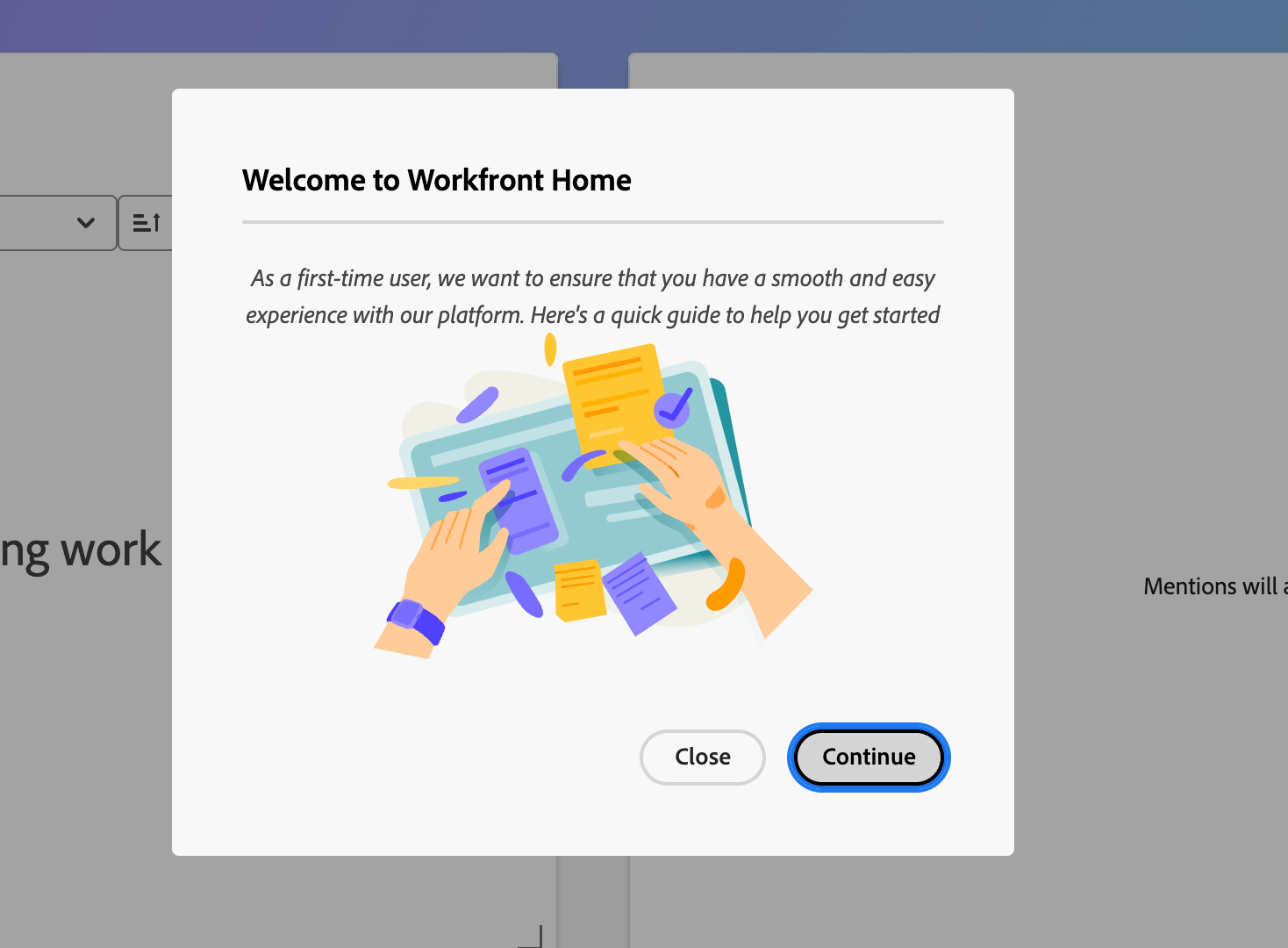
Workfront greets new users with a welcoming message and a vibrant illustration, instantly making the experience feel approachable. The copy clearly states the intent: to make onboarding smooth and easy. With a single call-to-action (“Continue”) and a secondary exit option (“Close”), users are gently encouraged to proceed without pressure. It’s a great example of a light-touch welcome that respects user choice while offering support.
15. Smartsheet’s Visual Intro Video

Smartsheet welcomes new users with a bold, branded modal featuring a prominent explainer video. The message is concise — “See what you and your team can do” — and encourages users to engage visually right away. By placing a “Learn More” link and a simple “Close” button, Smartsheet gives users low-pressure entry into the platform’s capabilities while letting the visuals do the heavy lifting.
Tips for an Engaging Welcome Message
Keep It Concise: Aim for 2-3 short sentences that convey the essential information.
Personalize When Possible: Use the user's name or role to make the message feel tailored.
Highlight Immediate Value: Clearly state what the user can achieve or access right away.
Use Clear CTAs: Guide users to the next step with buttons like “Start Tour” or “Explore Features.”
Match Your Brand Voice: Ensure the tone and design align with your overall branding.
Template: Example Welcome Message Copy
Welcome to [Your App Name], [User Name]! 🎉 We're thrilled to have you.
Let's get you started — try [Key Action] to see how it works.
Need help? [Link to help docs or chat].
Tools for Creating In-App Welcome Messages
Tool | Best For | Key Features | Pricing |
No-code welcome messages | Drag-and-drop editor, segmentation, analytics | Starting at $99/month | |
Appcues | Customized user flows | Advanced analytics, third-party integrations | Starting at $249/month |
Pendo | Enterprise analytics and onboarding | In-depth product analytics, feedback collection | Starting at $7,000/year |
Whatfix | Complex onboarding for enterprises | Step-by-step guidance, in-depth reporting | Custom pricing |
Case Studies: Success Stories
Duolingo: Duolingo saw a jump in retention after simplifying its welcome message and guiding users toward lessons based on their goals.
Grammarly: By adding a friendly welcome and linking directly to essential features, Grammarly increased its weekly active users by 25%.
Headspace: Introduced a calming welcome screen with immediate access to a short meditation, enhancing user satisfaction.
Breeze: "We started using Hopscotch for user onboarding and immediately our onboarding completion rates jumped from ~15% to 40-50%. Literally overnight." - Lucas Fraser, CTO.
Common Pitfalls and How to Avoid Them
Overloading Information: Avoid cramming too much content into the welcome message. Focus on key actions.
Lack of Personalization: Generic messages may not resonate. Use available user data to tailor the experience.
Missing Clear CTAs: Ensure users know exactly what to do next.
Ignoring Mobile Optimization: Test messages on various devices to ensure responsiveness.
Neglecting Follow-Up: The welcome message is just the start. Plan subsequent onboarding steps.
Lack of Testing: A/B test variations over time.
FAQs
Q: How do I decide what content to include in my welcome message? A: Start with a friendly greeting and provide links to essential features or a product tour.
Q: How can I test my welcome messages? A: Use A/B testing to experiment with different messages and track performance metrics like click-through rates.
Q: How long should a welcome message be? A: Keep it concise. The best welcome messages are under 30 words and focus on guiding users to the next step.
Q: Should I use images or just text on my welcome pop-up? A: Use 1 icon or visual if it enhances clarity or mood — but don’t clutter.
Q: How long should it be? A: Aim for under 30 words. Make it scannable.
Q: What’s a good CTA? A: “Take the tour,” “Set up your workspace,” “Try [key feature]” — keep it actionable.
Final Thoughts
An effective welcome message does more than just greet new users—it sets the tone, builds engagement, and increases retention. By setting up a personalized, well-designed welcome message with Hopscotch or a similar tool, you can create a memorable first impression that encourages users to stay and explore.
Ready to create your welcome message? Try Hopscotch’s free trial to start building customized, user-friendly onboarding flows today!
Convert more trials with Hopscotch
Simple and delightful onboarding tours your users will love.