Product Walkthrough Examples And Best Practices

Product Walkthrough Examples And Best Practices
Product walkthroughs – those step-by-step in-app guides and tutorials – can make or break your user’s first impression. Get them right, and you’ll delight new users and pave the way for long-term engagement. Get them wrong, and you may see users bail out before they ever experience your product’s value. In fact, 74% of potential customers will switch to a different solution if the onboarding process is too complicated, whereas 86% will stick around for the long haul if you provide an enjoyable onboarding experience with ongoing education. That’s huge for SaaS businesses. It means a friendly, effective product tour isn’t just a nice-to-have – it directly impacts your retention and revenue.
Why are Product Walkthroughs so critical?
Consider that modern software is packed with features, yet studies show 64–80% of features in the average product are rarely or never used. Often, it’s not because those features aren’t useful, but because users never discover or understand them. A guided walkthrough helps highlight your product’s “aha!” moments and core value. It ensures customers don’t get lost or overwhelmed – a crucial point, since 8 in 10 users have deleted an app because they didn’t know how to use it.
In an era where attention spans are short, a smooth onboarding tour can be the difference between a one-time user and a loyal advocate. It’s no wonder that even Gartner predicts by 2025, 70% of organizations will be using digital adoption platforms (like guided walkthrough tools) across their tech stack to improve user experiences.
Below, we’ll dive into some standout examples of effective product walkthroughs, and then explore best practices to help you craft tours that turn new users into power users. Whether you’re a product manager looking to boost adoption or reduce churn, these insights will ensure your product walkthroughs hit the mark with today’s users.
Best Practices for Creating Product Walkthroughs
A great product walkthrough doesn’t just explain functionality — it unlocks value, fast. These best practices will help you build walkthroughs that improve activation, retention, and user satisfaction.
✨ 1. Guide Users to the “Aha!” Moment
Your walkthrough should focus on getting users to their first moment of value — the point where they truly “get it.”
Identify what this moment is for your product. For example:
Facebook: connecting with friends
Dropbox: uploading and sharing a file
Prioritize the smallest number of steps that get users to this result.
Don’t distract with features that aren’t critical in the early experience.
🔑 Tip: Use analytics or customer interviews to identify when successful users had their breakthrough.
✂️ 2. Keep It Simple and Concise
Avoid overwhelming new users with too much information at once.
Use:
✅ 1–2 sentences per step
✅ Plain, jargon-free language
✅ Benefit-first messaging (e.g. “Track progress instantly” vs. “Click the analytics tab”)
✅ Progressive disclosure — introduce advanced features only when relevant
📉 Long, text-heavy tours lose users. Simplicity wins.
👥 3. Personalize the Experience
One-size-fits-all walkthroughs don’t work. Tailor based on:
🧑💼 User role (e.g. admin vs. contributor)
🎯 Use case (e.g. project management vs. personal notes)
📊 Behavior (e.g. show advanced tips only after mastering basics)
Options to personalize:
Branching logic
Setup questions
Conditional walkthroughs based on account data
📈 Customized tours = higher completion + better feature adoption.
⏱ 4. Trigger at the Right Time
Don’t force a massive tour on first login. Instead:
Trigger walkthroughs based on user action
Show tooltips contextually — when users visit key screens or encounter friction
Deliver onboarding progressively as users explore
🧭 Just-in-time beats just-in-case. Relevance = engagement.
🧩 5. Use Visuals and Interactive Elements
Highlight elements with arrows, spotlights, or modals.
Use animations or visuals to clarify action steps.
Prioritize interactivity — guide users to actually click, create, or complete tasks.
🧠 Users remember what they do — not what they read or watch.
💡 Pro tip: Interactive walkthroughs have been shown to boost feature adoption and retention over static help docs. Hopscotch makes it easy to build these without code.
🛑 6. Give Users Control
Always offer:
⏭️ Skip option
🔁 Replay or restart
❓ On-demand access via Help or Setup menus
Don’t lock users into rigid flows — it creates frustration and churn.
👋 Let users explore at their own pace, with support when they need it.
📊 7. Test, Track, and Iterate
Measure:
Walkthrough completion rate
Drop-off points (by step)
Activation and retention rates post-walkthrough
Test different formats:
Tooltip vs. modal
Long vs. short flows
Passive vs. interactive
Collect qualitative feedback: support tickets, user polls, interviews.
🧪 Onboarding should evolve as your product does. Continuous iteration is key.
🔄 8. Use Data to Continuously Improve
Walkthroughs are not set-it-and-forget-it. They’re a dynamic part of your UX.
Combine qualitative feedback (e.g. confusion points) with behavioral data to find friction.
Continuously refine based on:
Product changes
New user segments
Shifts in user expectations
📈 Companies that improve onboarding over time see dramatically better retention and lifetime value.
Want more metrics to guide your optimization? 📈 Check out: 12 Key Metrics for Tracking Product Adoption
Product Walkthrough Examples
Let’s break down real-world examples from top SaaS companies using walkthroughs effectively — with visual cues and strategies you can apply to your own product.
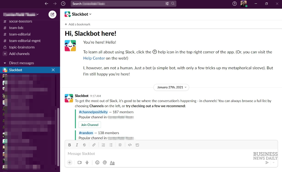
🟣 1. Slack – Interactive, Conversational Onboarding

Uses a friendly Slackbot to guide users through key actions like messaging and creating channels.
Keeps it short and conversational to reduce friction.
Uses progressive disclosure, only surfacing advanced features later.
🔑 Why it works: Feels like chatting with a teammate. Fast, focused, and fun.
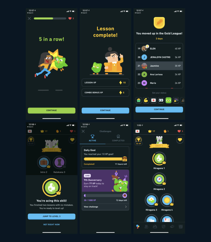
🟢 2. Duolingo – Gamified “Learn by Doing” Walkthrough

Skips the lecture — users immediately complete a lesson in their target language.
Uses visuals, characters, and rewards to reinforce progress.
Drives early “aha!” moments in the very first session.
🔑 Why it works: Quick win. Users experience the product’s core value right away.
🔵 3. Dropbox – Minimalist Setup Tour

Highlights just 1–2 key actions: uploading and accessing files.
Uses tooltips only when needed, not a full tour.
Values user autonomy — no unnecessary friction.
🔑 Why it works: Fast, unobtrusive, and laser-focused on user goals.
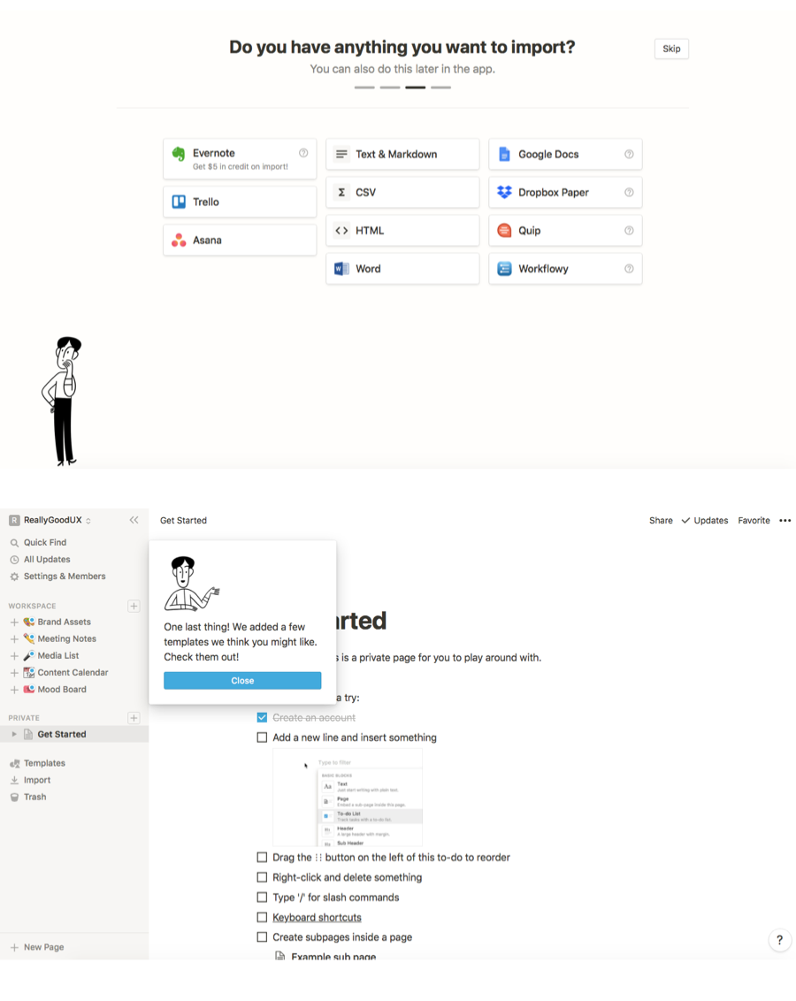
🟡 4. Notion – Contextual, Personalized Tips

Onboarding begins with a setup questionnaire to personalize experience.
Introduces features like databases, templates, and collaboration only when relevant.
Uses smart tooltips triggered by user behavior.
🔑 Why it works: Personalized guidance keeps users from feeling overwhelmed.
🟠 5. Canva – Behavioral Feature Prompts

Uses spotlights and pop-ups to introduce new tools based on user actions.
Offers short tutorials or suggestions instead of interruptive flows.
Helps users discover hidden efficiencies over time.
🔑 Why it works: Feels timely and helpful — never forced.
🔴 6. Airtable – Structured, Hands-On Tutorial
Walkthrough helps users build their first real database.
Combines step-by-step checklists with tooltips and interactivity.
Uses real examples to make features practical and tangible.
🔑 Why it works: Empowers users to learn by building, not just reading.
⚫ 7. Mailchimp – Checklist-Based Guided Setup

Provides a "Getting Started" checklist visible in the dashboard.
Encourages step-by-step completion with progress tracking.
Users can complete tasks in any order, adding flexibility.
🔑 Why it works: Gives users a clear path forward while letting them move at their own pace.
💡 Want more examples? Check out our full guide: 17 User Onboarding Examples That Nail It
How to Make a Product Walkthrough
If you’re ready to create a product walkthrough that boosts activation and improves user experience, you don’t need to start from scratch or involve engineers. With modern no-code tools like Hopscotch, building and deploying in-app guides is fast, flexible, and requires zero dev time.
Here’s a step-by-step framework to build your first walkthrough using Hopscotch:
1. Identify your goal.
Start by defining the purpose of the walkthrough. Are you onboarding new users? Driving adoption of a new feature? Reducing support tickets? Your goal will shape the structure, content, and triggers of your walkthrough.
2. Map the user journey.
Break down the exact steps a user needs to take to reach the desired outcome. For example, if your goal is to get users to complete their profile, your journey might include: uploading a photo, selecting preferences, and saving changes.
3. Launch Hopscotch and select elements for your walkthrough.
Use Hopscotch’s Chrome extension to overlay your product and create interactive steps—like tours, tooltips, modals, or hotspots—without writing code. You can attach walkthroughs to specific pages, actions, or user segments. → Example: Want to highlight a new dashboard feature only for returning users? Hopscotch lets you trigger it based on behavior or user properties.
4. Write concise, benefit-driven copy.
Use plain language and keep each step short. Instead of “Click here to view analytics,” say, “See how your campaigns are performing.” Focus on what’s in it for the user, not just what the button does.
5. Add visuals and interactivity.
Highlight UI elements using spotlights or arrows. Prompt users to take action ("Try uploading your first file") rather than just passively showing them how. Hopscotch supports interaction tracking, so you can make sure users complete steps before moving on.
6. Test, iterate, and personalize.
Use Hopscotch’s built-in analytics to track walkthrough completion rates, drop-offs, and downstream activation. A/B test variants or personalize flows for different personas (e.g. marketer vs. developer).
7. Maintain and update over time.
Walkthroughs should evolve with your product. Hopscotch makes it easy to update steps without needing engineering help. Revisit your guides regularly as new features roll out.
Want to see how fast it is to create your first walkthrough? Try Hopscotch free and build a product tour in minutes.
FAQ
What's the difference between a product walkthrough and a product tour?
A product tour provides a high-level overview of features without requiring user interaction, while a product walkthrough guides users through completing specific actions within the product. Walkthroughs are more interactive and focused on teaching through doing rather than just showing.
How long should a product walkthrough be?
Effective product walkthroughs should be as short as possible while still conveying necessary information—typically 3-7 steps for initial onboarding. Breaking longer walkthroughs into multiple smaller sequences improves completion rates and knowledge retention.
Should product walkthroughs be mandatory or optional?
The best approach is often a hybrid model: make a brief core walkthrough mandatory for essential functionality, then offer optional walkthroughs for advanced features that users can access when relevant to their needs.
How can I measure if my product walkthroughs are working?
Track completion rates, feature adoption following walkthrough exposure, reduction in support tickets about covered topics, and differences in retention metrics between users who complete walkthroughs versus those who don't.
When is the best time to introduce feature walkthroughs?
Feature walkthroughs are most effective when triggered contextually—either when users first encounter a feature, when they attempt but struggle with a task, or when usage patterns indicate they're ready for more advanced functionality.
Final Thoughts
Hopscotch makes it easy to create beautiful, product walk throughs without touching code.
📚 Read More
Looking for more?
Check out:
How to Set Up A Welcome Message in Your App: A Step-By-Step Guide: Creating a memorable first impression with new users is crucial. This guide walks you through setting up an engaging in-app welcome message
Best User Onboarding Tools for SaaS Companies Explore the top tools to create engaging, no-code onboarding experiences for new users.
Ultimate Guide to Product-Led Growth (with Examples) Learn how product-led growth strategies can improve user engagement and drive sustainable growth for your app.
12 Key Metrics for Tracking Product Adoption Discover the essential metrics to measure and optimize product adoption, helping you track the impact of new features and onboarding flows.
Best Ways to Increase SaaS Retention Retention is key to SaaS success—find out strategies and tools to keep users engaged long-term.
Convert more trials with Hopscotch
Simple and delightful onboarding tours your users will love.